Theming reference
Every surface, label, state color, icon, background, title-bar layer and interface sound in PiraChest comes from one theme preset. This page explains the 56 palette roles, the ten roots they derive from, the 178 icon slots, the full theme.json schema, and the machinery that puts it on screen.
Quick start
A theme is a folder inside PiraChest's data directory under themes/, containing a theme.json and any assets it needs. The fallback location when no app data directory exists is ~/.pirachest/themes. Folders whose names start with _ or . are reserved and ignored by the loader. Theme ids must be unique among custom themes and must not collide with a built-in id.
themes/
  midnight-ink/
    theme.json
    theme.qss
    assets/
      city.webp
      click.wav
      pause.png
The shortest useful theme sets five roles. It inherits everything else from the dark base and the derivation rules, so you get coherent borders, hovers, buttons, navigation and dialogs without writing them:
{
  "label": "Midnight Ink",
  "base_dark": true,
  "palette": {
    "page_bg": "#0b1020",
    "card_bg": "#131a2e",
    "primary_text": "#e8ecf5",
    "muted": "#98a2b8",
    "accent": "#6cb6ff"
  }
}
Save it, open Settings → Appearance → Theme, and pick it from the list. While a folder theme is active its folder, theme.json and theme.qss are watched; edits re-apply after a 250 ms debounce without a restart. A shader file referenced by the theme is watched too.
Screenshots
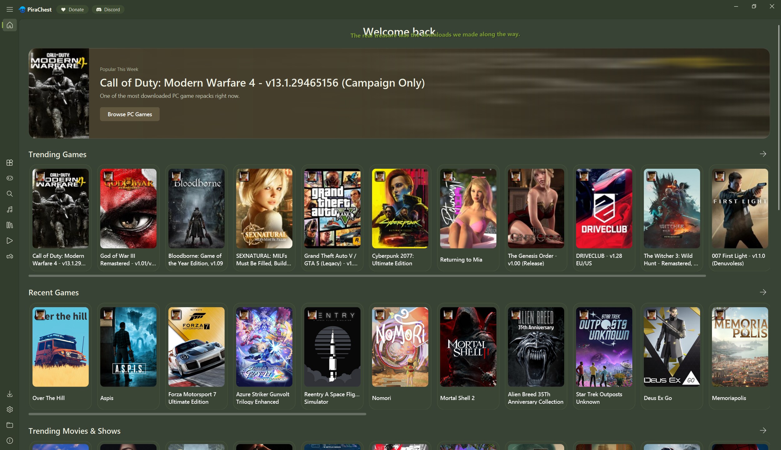
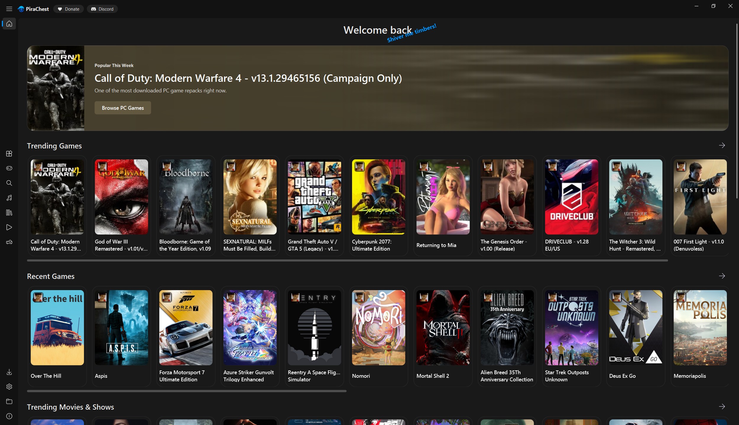
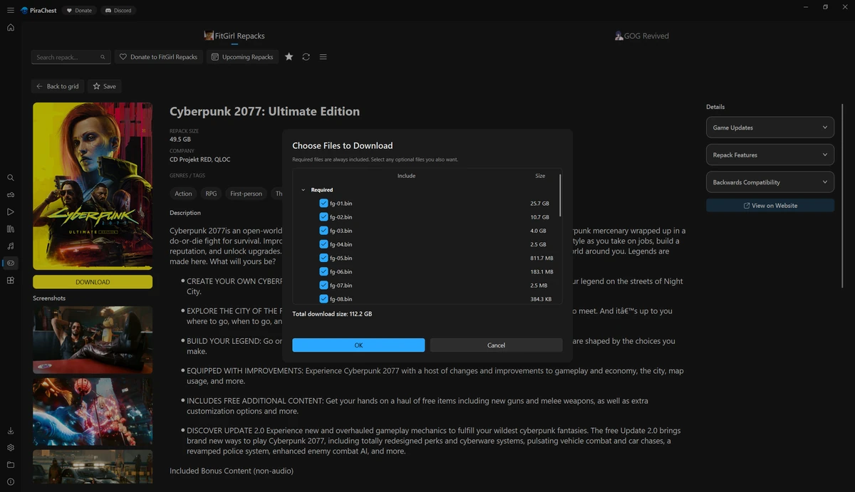
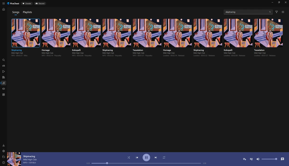
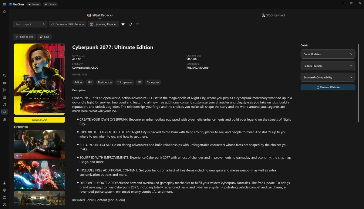
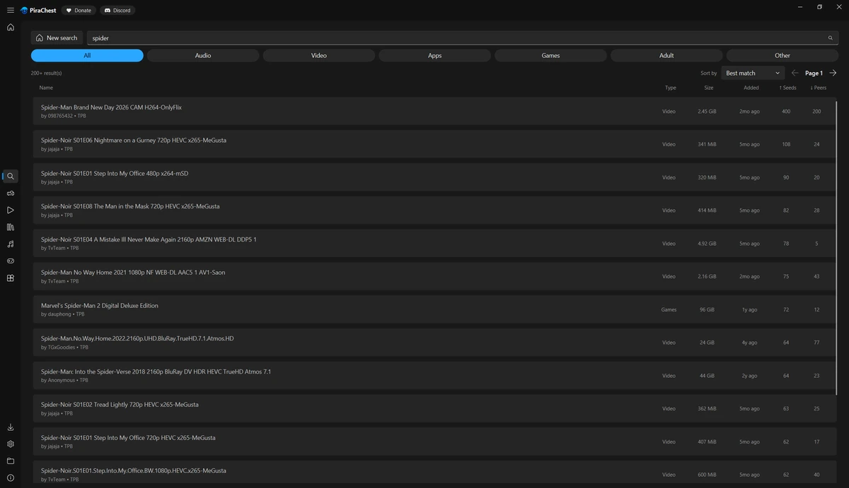
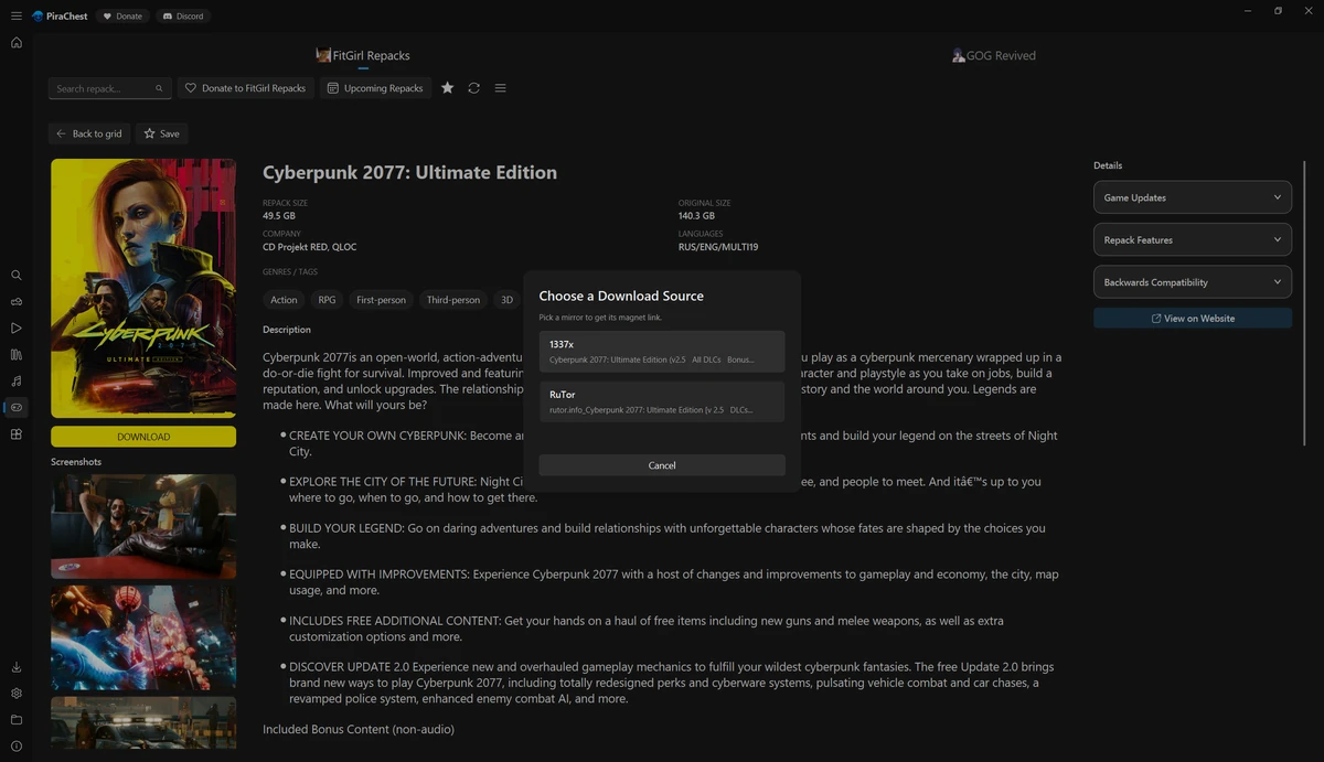
These are real captures from the 0.1.0-beta build, with each preset applied across the whole app. The theme is not a tint over a fixed shell: navigation, cards, inputs, dialogs, scrollbars, the title bar and the download states all move together.
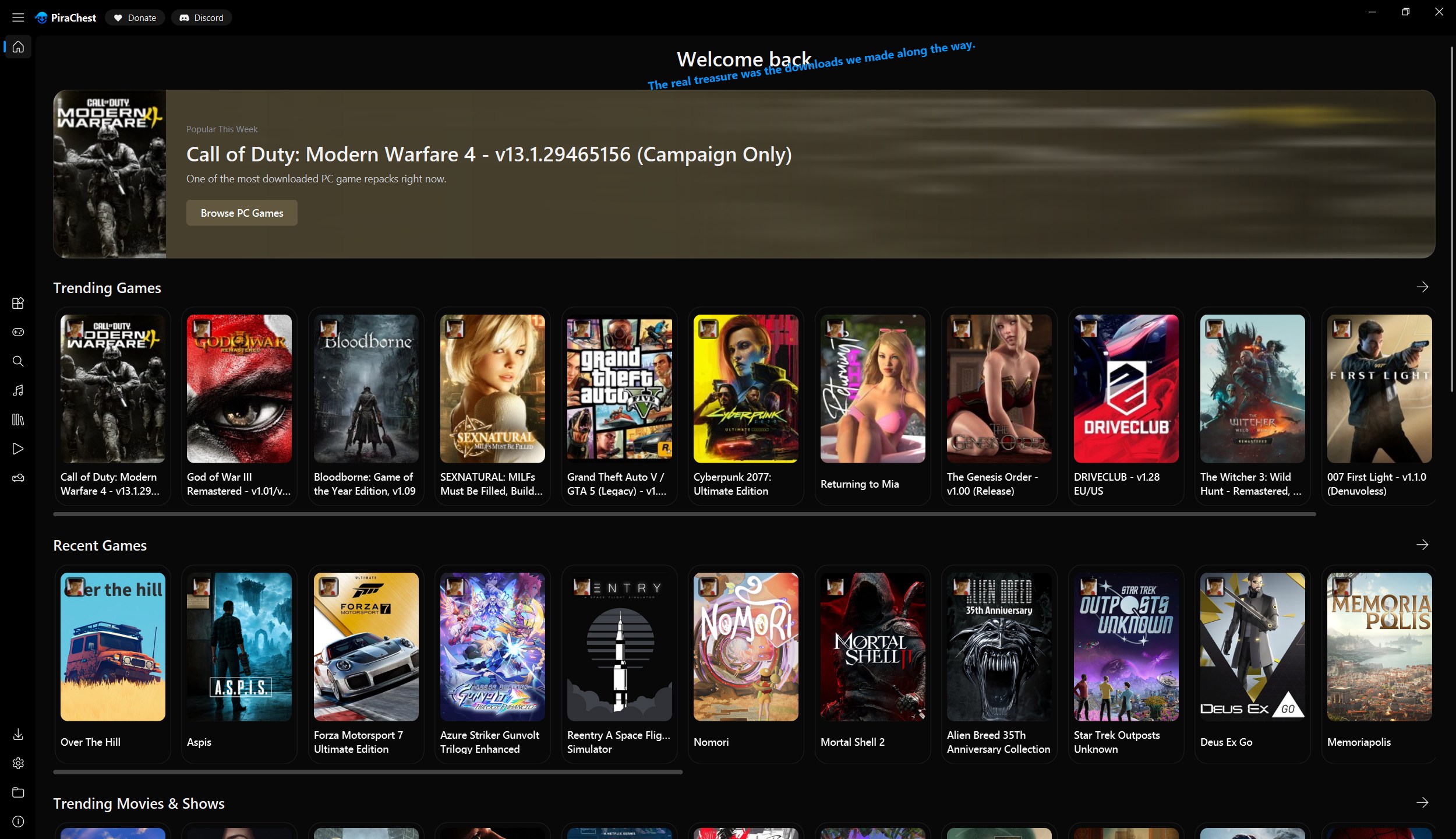
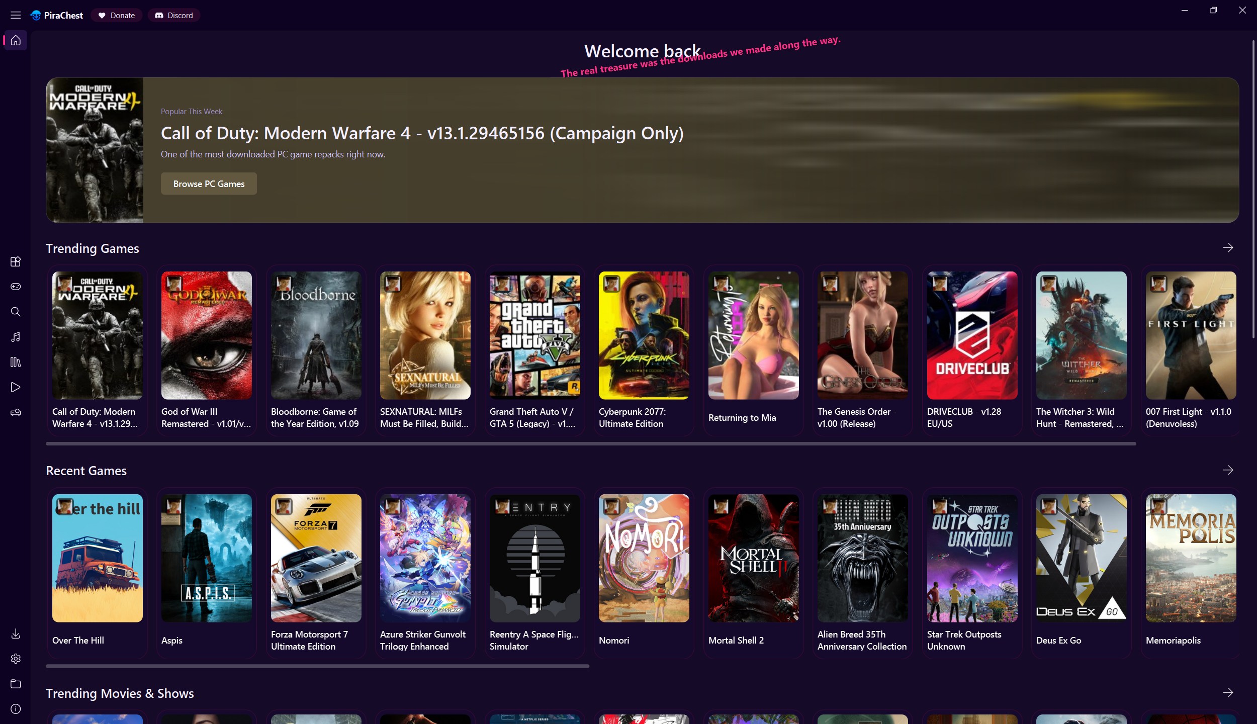
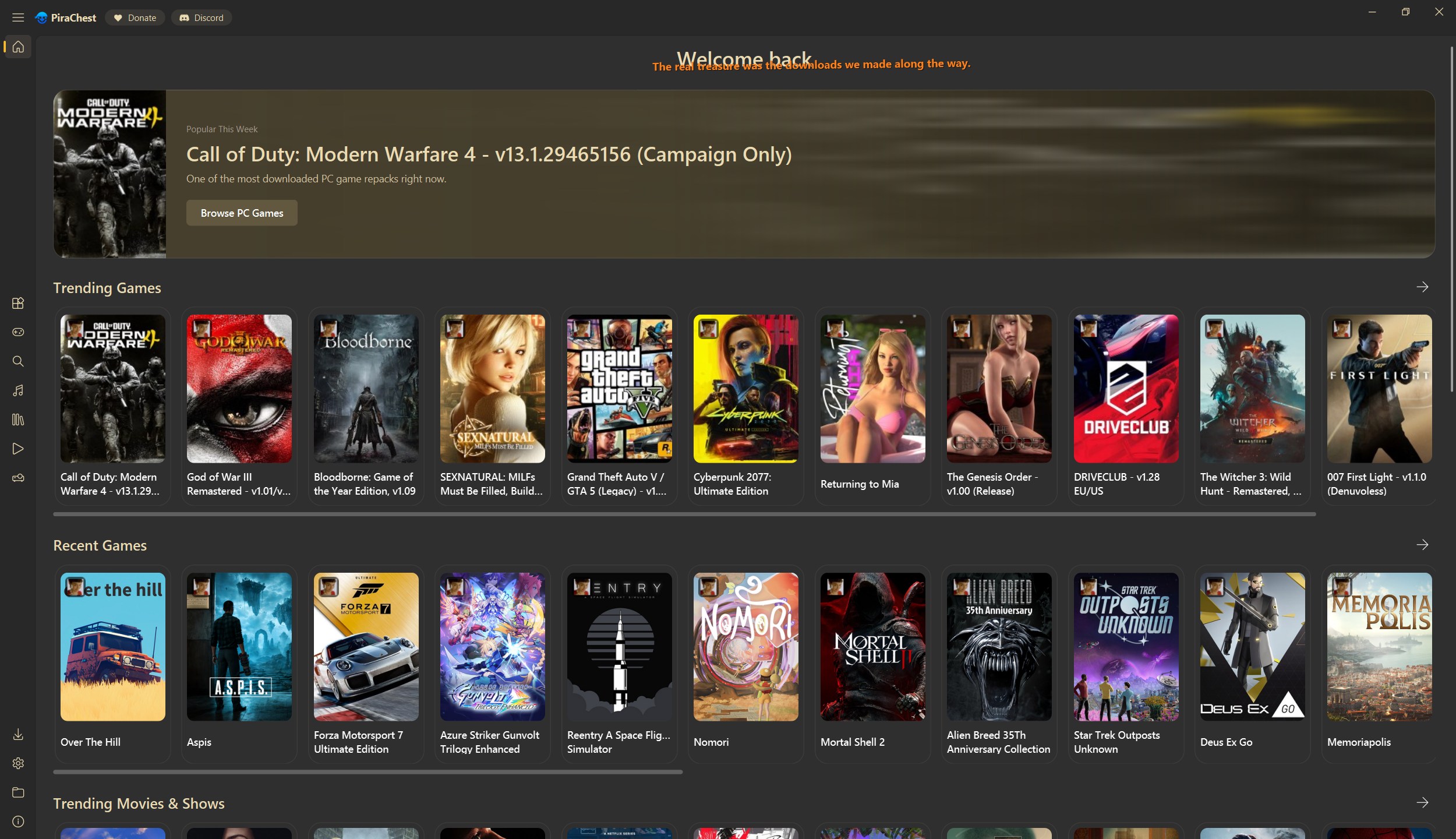
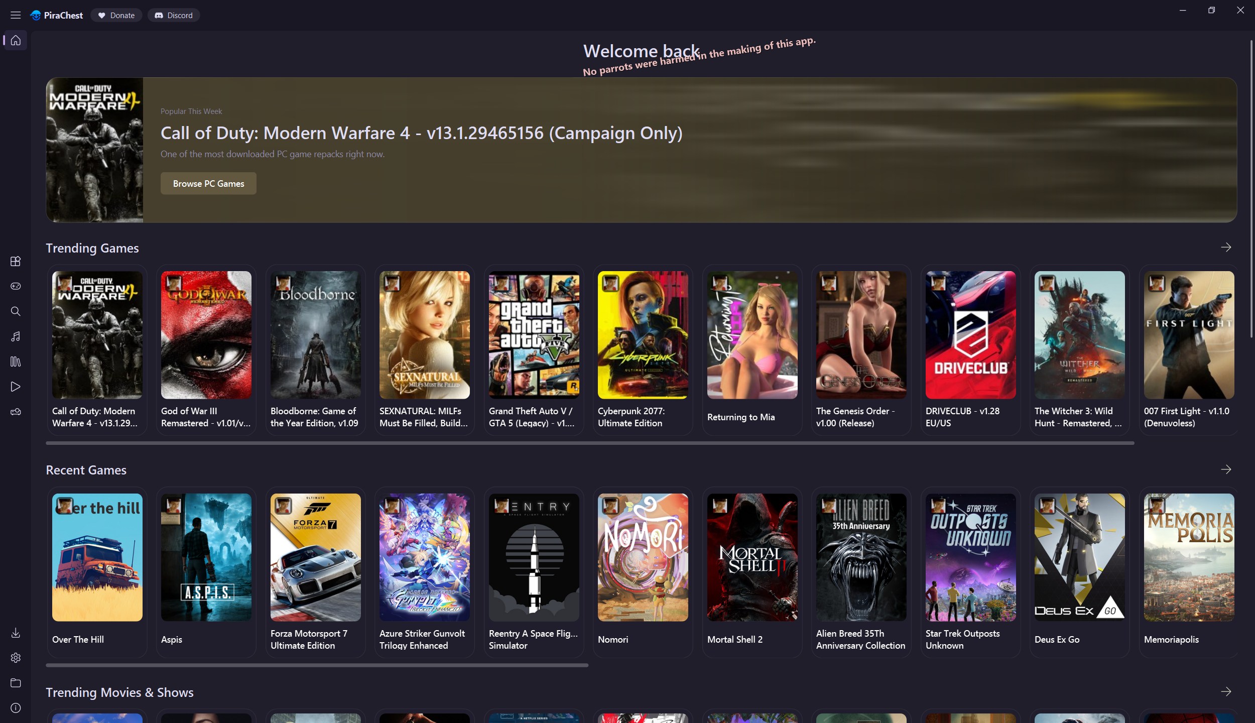
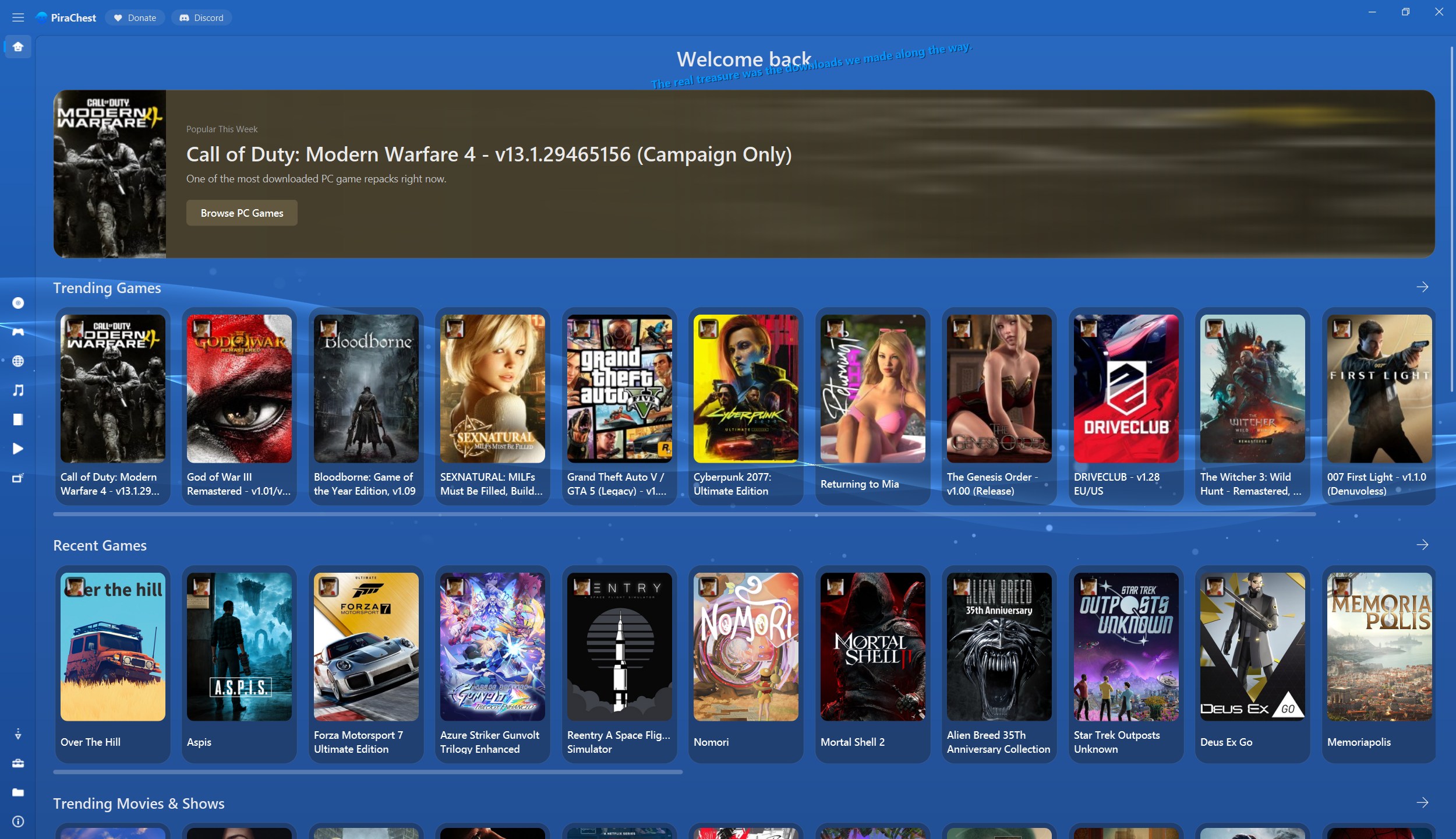
XMB is a community theme distributed through Discord, not one of the built-in presets. It is included here because it exercises the title bar, background and icon overrides at once.
Where the roles land
Roots and derivation
There are 56 palette roles. Ten are roots: page_bg, card_bg, primary_text, muted, accent, state_queued, state_downloading, state_verifying, state_seeding and state_error. Every other role has a built-in rule expressed over other roles. You override a role only when the rule's result is not what you want. Whatever you set wins; everything else follows the rules.
card_bg and muted are roots with useful fallbacks: lift(@page_bg,.035) and mix(@primary_text,@page_bg,.4). Set them when you have a specific surface or secondary ink in mind; leave them out and the theme still holds together.
| Root | What it anchors | Dark base default | Light base default |
|---|---|---|---|
page_bg | Window and page background | #121212 | #f3f3f4 |
card_bg | Cards, panels, detail boxes | #1b1b1b | #ffffff |
primary_text | Titles and primary text | #eaeaea | #101828 |
muted | Captions and secondary labels | #9a9a9a | #5b6472 |
accent | Links, focus, selection, badges | #c9c9c9 | #0078d4 |
state_queued | Queued transfers | #7a7a7a | #6b7280 |
state_downloading | Active transfers | #3b9df3 | #0078d4 |
state_verifying | Hash checks | #e08838 | #c15a0a |
state_seeding | Seeding and completed | #3fc240 | #0e7a0e |
state_error | Failures | #e5484d | #c42b1c |
The same dependency graph is used in reverse when a custom theme extends a base. Change primary_text, and muted, borders, nav text, dialog text and icons all re-derive instead of keeping the parent's old literals.
Color expressions
Every palette value is a string. These forms are accepted, case-insensitively for function names:
| Form | Meaning |
|---|---|
#rgb #rgba #rrggbb #rrggbbaa | Hex. Alpha digits come last (CSS order), not first as in Qt. |
rgb(r,g,b) rgba(r,g,b,a) | Channels 0–255. Alpha is 0–1, or 0–255 when the value is above 1. |
@role | Another role's resolved value. Chains are followed to the end. |
alpha(@role, .5) | Multiplies the color's existing alpha by the number. |
mix(@a, @b, t) | Linear blend per channel. t=0 is all @a, t=1 is all @b; alpha blends too. |
lift(@role, .035) | Raises a color toward white with a curve that responds hardest in dark midtones. This is what makes card_bg sit just above page_bg. |
{
  "palette": {
    "page_bg": "#0b1020",
    "card_bg": "mix(@page_bg, #ffffff, .06)",
    "surface_border": "alpha(@primary_text, .10)",
    "faint_text": "alpha(@muted, .55)",
    "btn_hover": "mix(@card_bg, @primary_text, .1)"
  }
}All 56 roles
Roles are grouped by what they paint. root marks the ten roots; a rule in the last column is the fallback used when the role is not set. The on_accent foreground is auto-corrected to whichever of white or #111111 contrasts better with the resolved accent, unless you set it yourself.
The two base modes override a few fallbacks. Both use @card_bg for dialog_bg. Dark also sets nav_selected_text to @primary_text, softer card_hover, btn_hover and section_card_bg mixes (.045, .07, .03) and a rgba(0,0,0,.30) list_bg. Light uses @card_bg for btn_bg, @section_card_bg for detail_box_bg, @surface_tint for poster_fallback_bg, alpha(@primary_text,.02) for nav_bg, a .04 section_card_bg and a rgba(0,0,0,.035) list_bg.
Roots
| Role | What it paints | Default |
|---|---|---|
page_bg root | Window, page and unpainted container background. | root |
card_bg root | Cards, panels, detail boxes and the default input fill. | lift(@page_bg,.035) |
primary_text root | Titles, primary labels and the default icon ink. | root |
muted root | Captions, secondary labels and metadata. | mix(@primary_text,@page_bg,.4) |
accent root | Links, focus, selection, count badges and filled accents. | root |
state_queued root | Queued download badge and queue progress. | root |
state_downloading root | Active download badge and progress. | root |
state_verifying root | Verification and hash-check badge. | root |
state_seeding root | Seeding badge; also backs the completed state. | root |
state_error root | Failure badge and destructive state text. | root |
Text
| Role | What it paints | Default |
|---|---|---|
body_text | Paragraph and sentence text. | mix(@primary_text,@page_bg,.15) |
faint_text | Weakest helper text, timestamps and hints. | mix(@muted,@page_bg,.25) |
accent_text | Text that deliberately uses the accent color. | @accent |
on_accent | Foreground on accent-filled badges, buttons and icons. | #ffffff, auto-corrected |
detail_title | Detail page title. | @primary_text |
detail_subtitle | Detail page accent subtitle. | @accent |
detail_meta | Detail page metadata and secondary facts. | @muted |
icon_color | Default tint for icons outside navigation. | @primary_text |
Surfaces
| Role | What it paints | Default |
|---|---|---|
card_hover | Card background on hover. | mix(@card_bg,@primary_text,.06) |
card_border | Card and panel outline. | alpha(@primary_text,.08) |
surface_tint | Subtle translucent overlay. | alpha(@primary_text,.05) |
surface_tint_strong | Stronger translucent overlay. | alpha(@primary_text,.09) |
surface_border | Dividers, chip borders and overlay outlines. | alpha(@primary_text,.1) |
hover_tint | Generic hover wash on non-card widgets. | alpha(@primary_text,.06) |
inactive_dot | Inactive pager and carousel dots. | alpha(@primary_text,.22) |
poster_fallback_bg | Backing behind a missing poster or cover. | @card_bg |
section_card_bg | Nested section card background. | mix(@card_bg,@primary_text,.05) |
section_card_border | Nested section card outline. | @surface_border |
scrollbar_handle | Scrollbar thumb. | alpha(@primary_text,.16) |
scrollbar_handle_hover | Scrollbar thumb on hover. | alpha(@primary_text,.26) |
Inputs and buttons
| Role | What it paints | Default |
|---|---|---|
input_bg | Text field, combo box and spin box fill. | @card_bg |
input_border | Input outline at rest. | alpha(@primary_text,.14) |
input_border_hover | Input outline on hover. | alpha(@primary_text,.22) |
input_border_focus | Input outline on focus. Accent-linked. | @accent |
btn_bg | Standard button background. | mix(@card_bg,@primary_text,.04) |
btn_border | Standard button outline. | @input_border |
btn_hover | Standard button hover fill. | mix(@card_bg,@primary_text,.1) |
btn_text | Standard button label. | @primary_text |
Detail views and lists
| Role | What it paints | Default |
|---|---|---|
detail_box_bg | Metadata box behind detail facts. | @card_bg |
detail_box_border | Metadata box outline. | @card_border |
list_bg | Backing behind list and table views. | alpha(@page_bg,.5) |
Navigation
| Role | What it paints | Default |
|---|---|---|
nav_bg | Sidebar background. | @page_bg |
nav_text | Sidebar label at rest. | @primary_text |
nav_icon | Sidebar icon at rest. | @primary_text |
nav_selected_bg | Selected navigation pill. | alpha(@primary_text,.12) |
nav_selected_text | Selected navigation label. Accent-linked. | @accent |
nav_selected_icon | Selected navigation icon. Accent-linked. | @accent |
nav_hover_bg | Navigation hover pill. | alpha(@primary_text,.07) |
Dialogs
| Role | What it paints | Default |
|---|---|---|
dialog_bg | Dialog and message box background. | @page_bg |
dialog_border | Dialog outline. | @card_border |
dialog_title_text | Dialog title. | @primary_text |
dialog_body_text | Dialog body copy. | @body_text |
dialog_accent_text | Dialog links and accent actions. Accent-linked. | @accent |
Derived states
| Role | What it paints | Default |
|---|---|---|
state_paused | Paused download badge. | @state_queued |
state_completed | Completed download badge. | @state_seeding |
state_cancelled | Cancelled download badge. | @state_queued |
Rules can reference any role, including one defined later. Resolution follows @ references recursively and detects cycles.
Contrast protection
After resolving the palette, the engine checks the roles that carry text or icons against the surfaces they actually sit on. If a pair falls below its target, the foreground is moved toward the page's ink pole until it passes, or until the floor is reached. This is why a hand-picked muted color can come back slightly lighter or darker than written.
| Role | Checked against | Target | Floor |
|---|---|---|---|
primary_text, body_text, detail_title | page, card, section card | 4.5:1 | — |
muted, detail_meta | page, card, section card | 4.0:1 | 3.5:1 |
faint_text | page, card, section card | 3.0:1 | 2.8:1 |
btn_text | button background | 4.5:1 | — |
nav_text | page, nav hover, selected pill | 4.5:1 | — |
nav_icon | page, nav hover, selected pill | 3.0:1 | — |
icon_color | page, card | 3.0:1 | — |
dialog_title_text, dialog_body_text | dialog background | 4.5:1 | — |
accent_text, dialog_accent_text | page, card, dialog | 4.5:1 | 3.0:1 |
detail_subtitle | page, card, detail box | 4.0:1 | 3.0:1 |
nav_selected_text | page, selected pill | 3.5:1 | 2.8:1 |
nav_selected_icon | page, selected pill | 3.0:1 | 2.5:1 |
All eight state_* roles | page, card | 2.5:1 | 2.0:1 |
Two extra safeguards run first. If primary_text is below 2:1 against page_bg, it is replaced with #f4f4f5 or #111318, whichever fits the page better. And if you do not set on_accent, it is chosen automatically for count badges, accent icons and other filled controls.
Built-in presets
PiraChest ships a plain Dark and Light mode plus thirteen named presets. Swatches show page, card, primary text and accent. The four-character code under each name is the accent role.
Labels shown in Settings differ from preset ids; extends takes the id (for example nord is the preset labelled Dune). Presets are locked to their own accent except AMOLED and the plain Dark/Light modes. A custom theme whose id collides with a built-in id is skipped and reported in the loader's errors.
Accent behavior
Setting an accent does more than set accent. It also rewrites five roles to @accent: nav_selected_icon, nav_selected_text, input_border_focus, dialog_accent_text and detail_subtitle. That is why a one-line accent change recolors the sidebar selection, focus rings, dialog links and detail subtitles together.
"locked_accent": true(the default for custom themes): the theme's own accent is always used."locked_accent": false: the user's accent from Settings is applied on top of the theme, re-resolving all derived roles. The five linked roles above are overwritten with@accent, so hard-coding them in an unlocked theme has no effect.- A top-level
"accent"key is shorthand forpalette.accent.
theme.json reference
| Key | Type | Notes |
|---|---|---|
id | string | Defaults to the folder name. Must be unique and not a built-in id. |
label | string | Display name. Defaults to the id. |
extends | string | Id of another theme to inherit from. See below. |
base_dark | bool | Chooses the dark or light base palette and the app's light/dark mode. Defaults to the parent's value, else true. |
palette | object | Role → expression. Unknown roles or non-string values are ignored with a warning. |
accent | string | Shorthand for palette.accent, applied after the palette. |
locked_accent | bool | Default true. See Accent. |
background | object | Image, GIF or shader background. See Backgrounds. |
backdrop | string | none, acrylic or blur. Native Windows DWM material. Windows only; resolves to none on Linux and macOS. |
transparent_window | bool | Forces a transparent window even without a backdrop. |
win7_frame | bool | Opts into the native Aero glass frame. Windows only. Never enabled implicitly. |
titlebar | object | The chrome DSL. See Title bar. |
icons | object | Slot id → Fluent name, image spec or {fluent|image, crop}. |
widget_icons | array | Widget selector → icon spec, applied after the theme. |
layout | object | Layout token overrides. Values are strings; unknown keys are ignored. |
qss | string | Raw Qt stylesheet appended to the app-wide sheet. |
rules | array | Structured {selector, state, css} rules. See QSS. |
font_families | array | Installed family names to prefer. |
font_paths | array | Font files relative to the theme folder, registered at load. |
sfx | object | Sound key → file. See Fonts & sounds. |
A theme may also contain theme.qss. It is read as UTF-8, capped at 256 KB, and concatenated with "qss" and the generated rules.
Loading never raises into startup. A malformed theme lands in the loader's errors and is skipped; recoverable problems land in warnings. Neither can prevent the app from starting.
Inheriting with extends
A child copies its parent's unresolved role expressions, then applies its own on top, so derived roles recompute from the child's roots. Retint one color of a built-in preset (here nord, labelled Dune) and everything derived from it moves too.
{
  "label": "Dune Ember",
  "extends": "nord",
  "palette": {
    "accent": "#d08770",
    "detail_subtitle": "@accent",
    "nav_selected_icon": "@accent"
  }
}
Parents can be a built-in or another custom theme, but custom folders load in alphabetical order, so a parent must sort before its child. An unknown parent produces a warning and falls back to the selected base palette.
When you override a surface root, the loader discards the parent's stale literal values for dependent roles before resolving. That means a child can change page_bg without inheriting the parent's hard-coded nav backgrounds and borders.
Backgrounds and window material
"background": {
  "type": "image",
  "file": "assets/city.webp",
  "blur": 18,
  "darken": 55,
  "scope": "client"
}| Field | Values |
|---|---|
type | image (default) or shader. A shader string also selects shader mode when type is absent. |
file | Image/GIF, or the shader source. Relative to the theme folder. If missing or unreadable the background is silently dropped. |
blur, darken | 0–100, defaults 12 and 45. Image type only. |
scope | content, client (default) or window: how much of the window the artwork covers. |
image, fps, aa | Shader only. Optional texture, frame rate 0–240 (0 means display rate), anti-aliasing limited to 0, 2, 4 or 8. |
"backdrop" applies a Windows DWM material: acrylic needs Windows 10 build 17134+, blur needs Vista-era build 6000+. On unsupported systems, including Linux and macOS, it quietly becomes none. A supported backdrop makes the window transparent automatically; "transparent_window": true forces it. Otherwise the window stays opaque on purpose, so an unthemed widget can never show a white hole. "win7_frame": true is a separate explicit opt-in for the native Aero glass frame; a backdrop never turns it on by itself.
Title bar and sidebar chrome
The titlebar object drives a custom-painted title bar, window buttons, header chips (Donate, Discord) and the sidebar. You specify only what differs from the defaults; objects merge deeply.
On Canary builds the window title ends in “ Canary”, and the title bar draws that word as a small CANARY badge after the app name. Its color follows the brightness of your title color, so it needs no theme settings.
| Key | Notes |
|---|---|
mode | overlay (default) paints only the bar. frame paints a border ring around the whole client area. |
height, frame | Bar height 16–96 (default 48); frame thickness 1–24 (frame mode only). height_maximized and frame_maximized override when maximized. |
inset_left, padding, padding_maximized | Left offset (default 46 for overlay, 0 for frame); [left,right] inner padding, optionally different when maximized. |
corner | default, square, round or small (Windows 11 corners). |
icon, dark, backdrop_tint, force_fallback | App icon size 8–48; explicit light/dark chrome; a tint over the native backdrop; skip the native material and use the painted fallback. |
title | size, bold, color, family, padding, and a glow of color, alpha, radius. |
chips | height, radius, padding, spacing, gap, icon, size, inherit_buttons and a style with normal/hover/pressed. |
buttons | width, height, spacing, bleed, style, per-kind overrides in kinds.min|max|close (including corners), and vector glyphs. |
nav | radius, text, icon, selected_text, selected_icon, indicator, separator, hover, selected, text_glow. |
chrome, sidebar, nav_background | linked shares one glass behind bar and sidebar (no seam); split gives the sidebar its own fill/layers. nav_background empty or transparent shows the chrome through; a color paints it solid. |
layers, fallback, hole | Paint stack for the chrome and for the non-native fallback. hole is client or content. |
Layers
Layers paint in order. Types: fill, gradient (stops as [position, color] pairs, direction, span in bar heights), band (a skewed highlight streak) and border (width, inset, radius_delta). target picks the area: chrome (default), window, client or content. Add "skip_maximized": true to hide a layer when maximized.
Colors here accept #hex, rgba(), @role, or {"active": ..., "inactive": ...} to change when the window loses focus. Title bar colors do not evaluate alpha(), mix() or lift(); precompute those into palette roles and reference them with @.
"titlebar": {
  "mode": "frame",
  "frame": 6,
  "height": 42,
  "corner": "round",
  "title": {
    "bold": true,
    "color": { "active": "@primary_text", "inactive": "@muted" }
  },
  "buttons": {
    "kinds": {
      "close": { "style": { "hover": { "fill": "#E81123", "glyph": "#FFFFFF" } } }
    }
  },
  "layers": [
    { "type": "fill", "color": "rgba(12,16,32,0.72)" },
    { "type": "gradient", "span": 1,
      "stops": [[0, "rgba(255,255,255,0.10)"], [1, "rgba(255,255,255,0)"]] },
    { "type": "border", "target": "window", "color": "@surface_border" }
  ]
}
Contrast is protected for you: when the sidebar sits on glass, nav text and icon colors are nudged until they pass the target against the chrome, and chip text gets the same treatment.
Icon overrides
Icons are addressed by slot ids grouped by area. There are 178 slots. The Theme Maker's Icons tab lists every slot with its default and a search box; the tables below are the same list.
| Area | Slots | Covers |
|---|---|---|
nav.* | 13 | Sidebar, header and data-folder actions. |
home.* | 10 | Category tiles, poster placeholders and chevrons. |
download.* | 22 | Transfer rows, bulk actions and drop zone. |
minerva.* | 4 | Game catalog download and sync actions. |
repacks.* | 14 | Source tabs, cards, navigation and site actions. |
badge.* | 5 | Badge slots: pink paw, hypervisor, Switch, NS2 and PS3. |
music.* | 31 | Player, cards, rows, playlists and search. |
books.* | 2 | Detail navigation and chapter downloads. |
tbhb.* | 10 | Result paging, detail statistics and reset. |
yt.* | 3 | Download gate, empty state and action. |
tv.* | 21 | Tabs, channel controls and the video player. |
settings.* | 36 | Every settings row, tab and folder picker. |
about.* | 3 | Repository, community and thanks actions. |
app.* | 4 | Donate chip, Discord chip and sync prompt. |
"icons": {
  "nav.home": "HEART",
  "nav.music": { "fluent": "MUSIC" },
  "download.item_pause": { "image": "assets/pause.png", "crop": true }
}- A bare string is a Fluent icon name (case-insensitive); an unknown name falls back to the slot default.
imagewith no slash is looked up in the theme'sicons/folder first, then its root. Paths may be relative to the theme folder, but a relative path that escapes it is rejected.crop(defaulttrue) trims transparent margins so artwork fills the icon box.- Fluent and bare icons are tinted with the theme's icon colors; images are drawn as-is.
repacks.tab_fitgirl,repacks.tab_gogandrepacks.tab_tbhbusebranded_icon(): the shipped source artwork is kept untinted by default. Override the slot to replace it; a Fluent override is tinted, an image override is not.
widget_icons targets widgets by selector instead of slot: [{"match": "#settingsButton", "spec": "SETTING"}], where spec uses the same forms as above. Widget icons are applied after the theme's slots and are meant for one-off UI, not a coherent icon set.
Navigation13 slots
| Slot | Default Fluent icon |
|---|---|
nav.toggle | MENU |
nav.home | HOME |
nav.downloads | DOWNLOAD |
nav.settings | SETTING |
nav.about | INFO |
nav.open_data_folder | FOLDER |
nav.minerva | APPLICATION |
nav.pc_games | GAME |
nav.music | MUSIC |
nav.books | BOOK_SHELF |
nav.youtube | PLAY |
nav.tv | PROJECTOR |
nav.tbhb | SEARCH |
Home10 slots
| Slot | Default Fluent icon |
|---|---|
home.category_repacks | GAME |
home.category_music | MUSIC |
home.category_anime | VIDEO |
home.category_youtube | PLAY |
home.category_manga | BOOK_SHELF |
home.category_tbhb | SEARCH |
home.poster_placeholder | PHOTO |
home.playlist_tile | MUSIC |
home.see_all_chevron | RIGHT_ARROW |
home.card_chevron | RIGHT_ARROW |
Downloads22 slots
| Slot | Default Fluent icon |
|---|---|
download.drop_zone | DOWNLOAD |
download.donate_copy_address | COPY |
download.item_pause | PAUSE |
download.item_resume | PLAY |
download.item_retry | SYNC |
download.item_open_file | DOCUMENT |
download.item_install | PLAY |
download.item_open_folder | FOLDER |
download.item_settings | SETTING |
download.item_cancel | CLOSE |
download.item_remove | DELETE |
download.stat_active | SPEED_HIGH |
download.stat_download | DOWNLOAD |
download.stat_upload | SHARE |
download.stat_queued | PAUSE_BOLD |
download.stat_completed | ACCEPT |
download.add_torrent | ADD |
download.pause_all | PAUSE |
download.resume_all | PLAY |
download.delete_all | DELETE |
download.open_downloads_root | FOLDER |
download.empty_state | DOWNLOAD |
Minerva4 slots
| Slot | Default Fluent icon |
|---|---|
minerva.tile_download | DOWNLOAD |
minerva.detail_download | DOWNLOAD |
minerva.download_selected | DOWNLOAD |
minerva.sync | SYNC |
Repacks14 slots
| Slot | Default Fluent icon |
|---|---|
repacks.card_fallback | GAME |
repacks.latest_prev | LEFT_ARROW |
repacks.latest_next | RIGHT_ARROW |
repacks.detail_back | RETURN |
repacks.detail_cover_fallback | GAME |
repacks.site_link | LINK |
repacks.donate | HEART |
repacks.upcoming | CALENDAR |
repacks.refresh | SYNC |
repacks.discord | CHAT |
repacks.tab_fitgirl | GAME |
repacks.tab_gog | GAME |
repacks.tab_tbhb | SEARCH |
repacks.browse_folder | FOLDER |
Badges5 slots
| Slot | Default Fluent icon |
|---|---|
badge.pink_paw | HEART |
badge.hypervisor | IOT |
badge.switch | GAME |
badge.ns2 | GAME |
badge.ps3 | GAME |
Music31 slots
| Slot | Default Fluent icon |
|---|---|
music.lyrics_back | RETURN |
music.lyrics_align | ALIGNMENT |
music.lyrics_font_size | FONT_SIZE |
music.card_play | PLAY |
music.card_download | DOWNLOAD |
music.card_add_to_playlist | ADD_TO |
music.card_more | MORE |
music.bar_shuffle | ROTATE |
music.bar_play | PLAY |
music.bar_pause | PAUSE |
music.bar_repeat | SYNC |
music.bar_lyrics | LABEL |
music.bar_volume | VOLUME |
music.bar_mute | MUTE |
music.album_fallback | ALBUM |
music.row_play | PLAY |
music.row_download | DOWNLOAD |
music.row_remove | DELETE |
music.playlists_header | MENU |
music.playlist_new | ADD |
music.playlist_detail_back | RETURN |
music.playlist_play_all | PLAY |
music.playlist_download_all | DOWNLOAD |
music.playlist_rename | EDIT |
music.playlist_delete | DELETE |
music.playlist_chevron | RIGHT_ARROW |
music.search_filters | FILTER |
music.search_playlists | MENU |
music.search_cancel | CLOSE |
music.search_prev_page | LEFT_ARROW |
music.search_next_page | RIGHT_ARROW |
Books2 slots
| Slot | Default Fluent icon |
|---|---|
books.detail_back | RETURN |
books.chapter_download | DOWNLOAD |
TBHB search10 slots
| Slot | Default Fluent icon |
|---|---|
tbhb.results_prev_page | LEFT_ARROW |
tbhb.results_next_page | RIGHT_ARROW |
tbhb.detail_back | RETURN |
tbhb.stat_category | TAG |
tbhb.stat_size | DOCUMENT |
tbhb.stat_seeders | UP |
tbhb.stat_leechers | DOWN |
tbhb.stat_uploader | PEOPLE |
tbhb.stat_format | ALBUM |
tbhb.new_search | RETURN |
YouTube3 slots
| Slot | Default Fluent icon |
|---|---|
yt.ffmpeg_gate | DOWNLOAD |
yt.empty_state | LINK |
yt.download | PLAY |
TV and anime21 slots
| Slot | Default Fluent icon |
|---|---|
tv.channels_add | ADD |
tv.channels_manage | SETTING |
tv.channels_filter | FILTER |
tv.channels_refresh | SYNC |
tv.channels_prev | LEFT_ARROW |
tv.channels_next | RIGHT_ARROW |
tv.media_back | LEFT_ARROW |
tv.player_skip_back | LEFT_ARROW |
tv.player_play | PLAY |
tv.player_pause | PAUSE |
tv.player_skip_forward | RIGHT_ARROW |
tv.player_volume | VOLUME |
tv.player_mute | MUTE |
tv.player_fullscreen | VIEW |
tv.player_fullscreen_exit | CLOSE |
tv.anime_back | LEFT_ARROW |
tv.anime_download | DOWNLOAD |
tv.tab_movies | MOVIE |
tv.tab_series | VIDEO |
tv.tab_anime | VIDEO |
tv.tab_channels | TILES |
Settings36 slots
| Slot | Default Fluent icon |
|---|---|
settings.theme_mode | BRUSH |
settings.accent_color | PALETTE |
settings.background | PHOTO |
settings.background_blur | FILTER |
settings.background_darken | QUIET_HOURS |
settings.language | LANGUAGE |
settings.launch_at_startup | SPEED_HIGH |
settings.console_structure | IOT |
settings.auto_download | MEDIA |
settings.delete_torrent | DELETE |
settings.download_limit | SPEED_HIGH |
settings.upload_limit | SPEED_HIGH |
settings.seed_time | HISTORY |
settings.on_finish | POWER_BUTTON |
settings.close_to_tray | MINIMIZE |
settings.folder_minerva | FOLDER |
settings.folder_repacks | FOLDER |
settings.folder_music | FOLDER |
settings.folder_manga | DOCUMENT |
settings.folder_youtube | FOLDER |
settings.folder_anime | VIDEO |
settings.folder_tbhb | FOLDER |
settings.tab_manga | DICTIONARY |
settings.notify_download | RINGER |
settings.sfx_volume | VOLUME |
settings.ambiance_volume | MUSIC |
settings.external_client | SEND |
settings.make_default | RINGER |
settings.repair_associations | SYNC |
settings.admin_mode | DEVELOPER_TOOLS |
settings.show_console | CODE |
settings.log_to_file | SAVE |
settings.software_updates | SYNC |
settings.theme_maker | BRUSH |
settings.clear_cache | BROOM |
settings.wipe_all | DELETE |
About3 slots
| Slot | Default Fluent icon |
|---|---|
about.github | GITHUB |
about.discord | CHAT |
about.thanks | HEART |
App chrome4 slots
| Slot | Default Fluent icon |
|---|---|
app.donate_heart | HEART |
app.discord_chip | CHAT |
app.sync_prompt_info | INFO |
app.sync_prompt_close | CLOSE |
QSS, rules and layout tokens
For anything the palette cannot express you can write Qt stylesheet, three ways. All are concatenated into one app-wide stylesheet and can use @role and $layout tokens, which are substituted before Qt sees them. Unknown tokens are left as written:
- a
theme.qssfile in the theme folder (first 256 KB), - a
"qss"string intheme.json, - structured
rules.
"rules": [
  { "selector": "PrimaryPushButton", "state": ":hover", "css": "border-radius: 999px;" },
  { "selector": "#settingsPage CardWidget", "css": "background-color: @card_hover;" }
]
Selectors support #objectName, ClassName (subclasses match) and a two-part Ancestor Class. Why does this exist when app-level QSS is already there? Because widget-level stylesheets beat qfluentwidgets' own, which app-level QSS cannot. Rules are therefore also stamped onto matching live widgets after each theme apply, behind a hidden marker property, so they reliably win.
Layout tokens
Override any of these under "layout" (values are strings; unknown keys are ignored):
card_padding 12px 16px | card_radius 10px | dialog_radius 12px |
input_padding 7px 10px | input_radius 6px | input_border_width 1px |
btn_padding 7px 16px | btn_radius 6px | input_border_width_focus 2px |
group_title_pad_top 8px | group_title_pad_bottom 4px |
"layout": {
  "card_radius": "14px",
  "btn_radius": "8px"
}
Fonts and sounds
font_paths are font files relative to the theme folder, registered once each; font_families names additional installed families. Registered files come first in the resulting preference list, followed by your families, then the app's fallbacks.
"font_paths": ["assets/Inter.ttf"],
"font_families": ["Segoe UI"],
"sfx": {
  "click": "assets/click.wav",
  "hover": "assets/hover.wav",
  "navigate": "assets/nav.wav",
  "ambiance": "assets/rain.ogg",
  "popout_info": "assets/info.wav",
  "popout_success": "assets/success.wav",
  "popout_warning": "assets/warn.wav",
  "popout_error": "assets/err.wav"
}
Allowed sfx keys are exactly: hover, click, navigate, ambiance, popout_info, popout_success, popout_warning and popout_error. The four popout_* sounds play when an InfoBar appears, chosen by severity. Missing files are dropped silently. Ambiance is a looping bed that only runs while media is actually playing.
Theme Maker
Open it from Settings or with Ctrl+Shift+T. Ctrl+Shift+P starts element picking anywhere in the app.
- Element: pick any widget, choose a selector (object name, class, or ancestor + class) and a state, then edit colors, shape, text and size. This writes
rules. - Colours: the 56 roles, grouped and searchable, with root recommendations and live swatches.
- Icons: all 178 slots with search and defaults.
- Backdrop: background type, image or shader, blur, darken, scope, FPS and anti-aliasing.
- Title bar: live-validated JSON for the chrome DSL.
- Fonts: families and font files, plus layout tokens.
- SFX: one row per sound key, with file pickers and a test playback.
- Code: raw QSS and the generated
theme.json.
Full undo/redo (Ctrl+Z / Ctrl+Y or Ctrl+Shift+Z), a compare toggle against the original theme, and an auto-saved draft (_draft.json, written 800 ms after the last edit) that resumes after a crash. The live preview uses a draft id, so the saved theme on disk is untouched until you press Save.
Save (Ctrl+S) copies every external file into assets/, rewrites paths to relative, writes theme.json and activates the theme. Export zips the folder; Import unzips a package, which must contain theme.json and must not contain unsafe paths. Open saved edits an existing theme; New starts from the current palette. Closing without saving restores your previous theme.
Sharing theme packs
A theme pack is the theme folder zipped at its root, so the archive contains theme.json directly rather than a nested folder. Export from Theme Maker produces exactly that. To install a pack someone sent you, import it through Theme Maker; the archive is extracted into the themes directory under a slug of the file name.
Because a pack can carry images, fonts, shaders, sounds, QSS and icon artwork, it is code-adjacent: only import packs you trust. The importer rejects absolute, drive-qualified and parent-traversal paths, but it does not scan assets for anything else. Theme packs never include your settings, debrid tokens or download history.
Per-user overrides
Users can recolor on top of any theme without editing it. These live as _font_colors.json, _tr_colors.json and _icon_overrides.json in the themes directory, which is why _-prefixed folders are reserved. Text and icon color resolution runs: per-label override, then per-role override, then the theme's palette. A user icon override beats a theme's icons entry.
_font_colors.jsonmaps a text or icon role to a color, for every widget using that role._tr_colors.jsonhas separatetextandicontables keyed by translation id, for one label or button._icon_overrides.jsonmaps an icon slot to an image, with the same path rules as a theme'sicons.
Only text and icon roles can be overridden this way, not surfaces. The Theme Maker's compare toggle ignores these overrides, so you see the theme itself rather than your local tweaks.
Theme performance
A theme is data, not code, but it still decides how much work the app does. The expensive parts are animated backgrounds, large bitmap assets and broad widget rules. The palette itself is cheap: 56 role expressions resolve once per apply, and the result is cached by a theme signature.
What is already cheap
- Palette resolution. A few dozen string expressions resolve in microseconds. Re-applying an unchanged palette bumps no version and rebuilds nothing.
- QSS builders. Generated stylesheets are cached per theme signature and per surface. Returning to a theme you used before reuses the sheet.
- Icons. Tinted icons pass through a 256-entry LRU cache, and painted navigation icons have a second cache. Reusing the same slot or Fluent name is effectively free.
- Window glass. Frame-mode chrome is pre-rendered into a pixmap and reused until the window size or theme changes.
- Rules. Live-widget rule stamping only runs when the theme actually defines rules or widget icons. A palette-only theme never pays for a widget scan.
Animated backgrounds
Shader backgrounds are the largest optional cost. fps defaults to 0, which means "follow the display refresh rate". On a 144 Hz panel that is up to 144 full-window repaints per second; on battery, cap it explicitly:
"background": {
  "type": "shader",
  "file": "assets/waves.frag",
  "fps": 30,
  "aa": 0,
  "scope": "content"
}
fps: 30is enough for slow ambient motion and roughly halves the paint work of 60 FPS.fps: 60is a good compromise for faster motion.aa: 0is the cheapest anti-aliasing mode. Use2when edges shimmer, and reserve4or8for still showcases.scope: "content"paints less area than"client", and"window"paints the most.- The shader pauses when the window is minimized or PiraChest is not the active app. It cannot pause for a hidden tab inside the window, so prefer a still background if you leave PiraChest visible on a low-power machine.
Image and GIF backgrounds
Images are scaled and composited on every resize and repaint. GIFs decode frame by frame, and video backgrounds keep decoding while they play. Animated media pauses when PiraChest is minimized or in the background. Keep the source close to the size you actually display, and avoid 4K animated GIFs:
- Export a 1920×1080 or smaller WebP/JPEG. A 4K PNG costs memory even when it is downscaled.
- Prefer WebP or JPEG for stills, and a short WebP animation or shader for motion. GIF is the most expensive animated format and has the worst quality per byte.
- Blur and darken are extra full-surface passes. Use the lowest values that keep text readable.
- A background is decoration, not a second copy of the wallpaper. One image reused across scopes is cheaper than several large files.
Icon artwork
Slot images are loaded and cropped once per size, then cached. Supply roughly the displayed size instead of a 2048px master:
- 64–256 px square PNG/WebP is enough for the 16–48 px slots used by the app and title bar.
- Keep transparency;
crop: trueremoves empty margins and makes small icons legible. - Set
crop: falseonly when the artwork's padding is intentional. - Branded Repacks icons are drawn untinted. Do not supply a dark-only logo that disappears on light themes.
QSS and rules
Every structured rule is matched against live widgets on apply, and matched rules are stamped onto each widget's stylesheet. A handful of targeted rules is cheap; hundreds of broad class selectors are not.
- Prefer an object name (
#detailsPage) or an ancestor plus class (#settingsPage CardWidget) over a bare class name. - Keep
theme.qssfocused. It is capped at 256 KB, but a smaller sheet is faster to parse and easier to reason about. - Do not restate fonts, colors or radii that the palette already provides. Change the role or layout token instead.
- Heavy effects such as large
box-shadoworblurin QSS are repainted with the widget; use them on a few focal elements, not every row.
A quick budget
| Choice | Good default | Why |
|---|---|---|
| Shader FPS | 30 on laptops, 60 on desktop | Cuts continuous repaints without visible stutter in ambient motion. |
| Shader AA | 0, then 2 if needed | Higher sample counts multiply fragment work. |
| Background scope | content | Leaves the sidebar and chrome out of the animated surface. |
| Still background | ≤1920×1080 WebP/JPEG | Lower decode cost and memory than a 4K PNG or GIF. |
| Icon masters | 64–256 px | Enough detail for the rendered sizes; faster to crop and tint. |
| Structured rules | Targeted selectors, a few dozen at most | Each rule is matched and stamped onto matching live widgets. |
How it reaches the screen
- Resolve. The manager resolves role expressions into a flat palette, enforces contrast, and bumps a version counter only when the palette, layout, preset or custom QSS really changed.
- Render QSS. Builders for base text, settings pages, dialogs, cards and scroll areas fill
@/$templates and cache by a signature of the current theme, so flipping back to a previous theme costs almost nothing. - Refresh widgets. A widget calls
register_theme_refresh(widget, callback)once; the callback runs immediately and again on every real theme change. Hidden widgets are marked stale and catch up when shown. Destroyed widgets drop out automatically. - Chrome. A
WindowChromeobject resolves the title bar spec once per apply into ready-made colors, brushes and fonts, then paints from that cache. Frame-mode glass is pre-rendered into a pixmap and reused until size or theme changes. Sidebar items are painted by a patched navigation button that draws only icon and label; the sliding pill is the sole selection indicator. - Rules and widget icons. Finally, structured rules and widget icons are stamped onto matching live widgets.
During a switch, visible top-level windows have updates frozen and thawed afterward so users never see a half-restyled window. Dialogs and shader-background windows are exempt.
Hot reload: while a folder theme is active, edits to its folder, theme.json, theme.qss or shader file are picked up after a 250 ms debounce and re-applied without a restart.
Cost control: tinted icons go through a small LRU cache, painted nav icons through another, QSS templates are cached per theme signature, and window glass is cached as a pixmap. A theme switch rebuilds only what changed; switching back to a theme is close to free.
Debugging checklist
- Theme missing from the list? Check for a built-in id collision, invalid JSON, or a folder name starting with
_or.. Errors are logged as "theme ... skipped". - Hot-pink areas? A circular
@reference or a role name typo. Check warnings forundefined role/circular reference. - Color looks wrong with
alpha()/mix()? Nested calls andrgba()inside arguments do not parse; use hex or@role. - Your color came back different? Contrast enforcement moved a text or icon role to meet its target. Check the table above, then raise the color deliberately if you want a different result.
- Background not showing? The file path did not resolve inside the theme folder. Use
assets/name.ext. - Accent ignored?
locked_accentis on. If it is off, the five accent-linked roles are always overwritten by the user accent. - Parent not found? The parent folder sorts after the child. Rename so it loads first.
- Rule not winning? The selector did not match a live widget. Rules stamp onto instances; an object name that only exists after navigation is matched when the theme is next applied or the page is created.
- No backdrop or glass on Linux or macOS? Window materials are Windows-only;
backdropfalls back tononethere. - Image icon looks cropped or tiny? Set
"crop": false, or supply artwork with the intended padding. Images are never tinted.